


Web3 SEO

Market Making

Community Development
User Acquisition
Social Media Growth
KOL Marketing
Airdrop Management
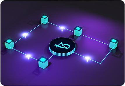
Ecosystem Development
Branding
Graphics & Content Design
Web3 Product Management
Digital Ads
Email Marketing
Founder’s Profile Management
Tokenomics Development
Web3 PR


Partnering with ARC3, was a game-changer for our decentralized platform. Their team guided us through every step — from smart contract development to wallet integration

DK. Singh
Co-Founder, DeFiVerse
We needed a team that truly understood the blockchain space, and [Your Company Name] delivered beyond expectations. Their understanding of dApps and NFT ecosystems is unmatched.

Luis M
CTO, MetaMint
We were worried about making the leap to Web3, but ARC3 made it painless. Their approach is grounded, strategic, and technically flawless.

Dana K.
Product Manager, TokenBridge Inc.


Jan 04, 2025
The ARC3 Playbook: Launch Campaigns That Actually Convert

Jan 04, 2025
The ARC3 Playbook: Launch Campaigns That Actually Convert
Jan 04, 2025
The ARC3 Playbook: Launch Campaigns That Actually Convert